
Data Visualization & Analytics Presentation
Problem
As a Web Design & Analytics Intern for Disney, I was tasked with interpreting and presenting analytical data for high volume internal website traffic. I needed to pull the pertinent information, rank it's relative level of importance, organize and present it in a way that would be easy for non-technical audiences to understand. Additionally, I needed to look for opportunities to improve: the data, strategy, and visuals.
Visual Design
I wanted to keep a simpler color palette for the presentation design and chose a blue, sea green, and gray/blue that I thought would work well and have a decent amount of contrast on the slides as well as a professional and corporate look. The typography is a humanist sans-serif with varying weight usage throughout. My goal was to design a presentation that was easy to follow and concise with just enough design to be visually interesting given the topic and time frame.
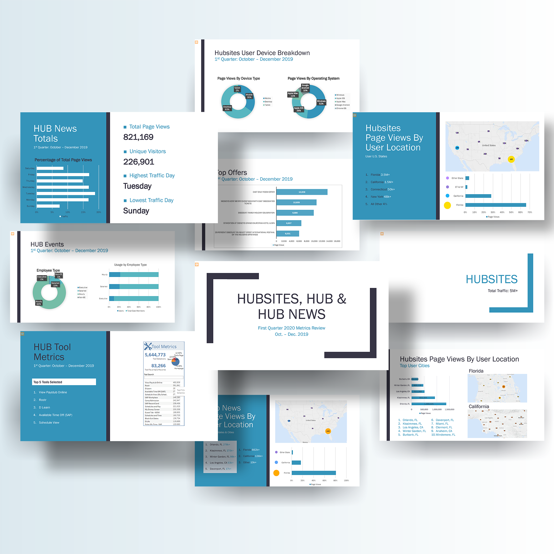
Data Visualization & Strategy
After reviewing prior quarters presentations and assessing the data available, with Adobe Analytics and Tableau, I pulled all the data and reports needed to start. I noticed that a lot of information was in list format and was a bit tedious to read. I also noticed that some data from prior presentations was not presented in the most effective way. For example: Site usage by state and city was previously displayed in a donut graph and did not include 100% of the data.
To improve this, I generated a map visualization using bubble charts (multi-variable graphs that are a cross between a scatterplot and a proportional area chart) and used that to visualize the page views by user location. Something else I noticed was that parts of the data were not in context; unique visitors by employee type was given in percentages to total site visitors but not to total employees within each type's group. By gathering additional employee type data I was able to put the data we already had into relative context. I was able to show that although Executive employees make up a small percentage of the total site visitors, almost the same percentage of Executives make up unique visitors as each other employee type group; therefore the content on the site is relevant to this employee type just as much as other employee types.