OVERVIEW
PowerDMS is a SAAS company specializing in compliance document management for organizations, helping customers simplify how they create, track, and attest to policies, training, and industry standards.
ROLE + SCOPE
Role: Product Designer
Timeline: 3-4 Sprints
Platform: Desktop Application
PROBLEM
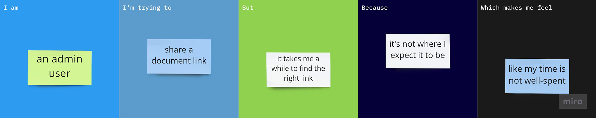
Users are not able to copy the appropriate document link which results in interruptions in their organizational workflow. The URL in the browser does not link to the document directly that their organization needs to view. The existing functionality for this is several clicks away in a document settings section.
Additionally, available document options and features are not discoverable.
Methodology
Competitive and Comparative Analysis
Desktop Product Usability Testing
Information Architecture
User Interviews
Customer Research
Process & Research
/t
Starting with Research
First things first, starting with research as the designer on this task included some comparative and competitive analysis. How are our competitors addressing this problem or lacking to address this?
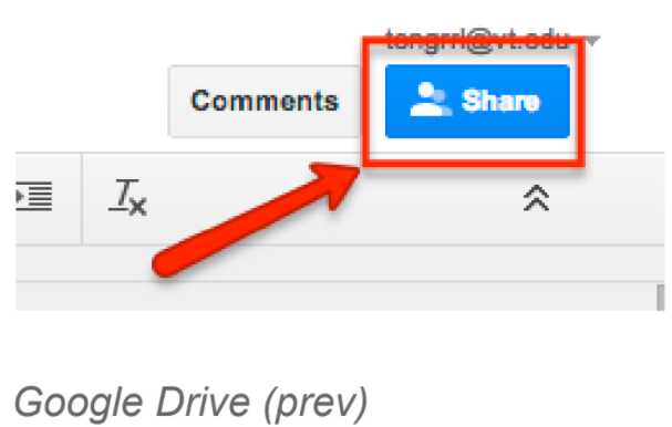
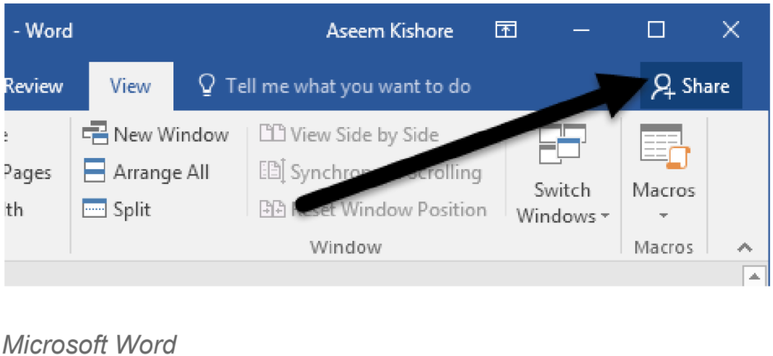
What I found was that the common pattern for document share capability is for the button to be near the top navigation of a component. Researching other products in the market has lead to the assumption that users expect to be able to access this functionality around here:
Listing out my initial assumptions will allow us to disprove or validate them later.

What are our goals?
We want to make it easy and efficient for a user to find and copy the link to the published revision of a document. To do this there are some additional questions I needed to ask:
d When does the user want to copy this link?
d What do they want to do with it?
d Where are they in the product at this time?
d How often is this task repeated?
Expected Findings
Some users either could not find the correct link but were not aware they copied the wrong link until others relayed to them that the link was not working or were able to find the correct link within the document manage page at the cost of several clicks and time spent. For admin users with a frequent need to share document links they have memorized where to find the action over time. They are most often starting this flow from the document view page of the site and then navigating to the document manage page, the correct tab and then collecting the document link from the bottom of that page.
Unexpected Findings
Upon looking into user behavior on the document view page, it was discovered that a dropdown menu housing various document options was very under utilized. The menu options would only show on hover and click under the title of a document. Users are generally not discovering the options here until after product training and heavy usage. Since actions within this menu change depending on the current state of the document (draft, published, revision number, signed/needs signature, in a workflow, etc.), the changes in the menu are also not always apparent to the user.
=l
With all this considered, how might we improve this copy link experience while also ensuring that this and additional menu actions are discoverable?
Ideation & Design
tq
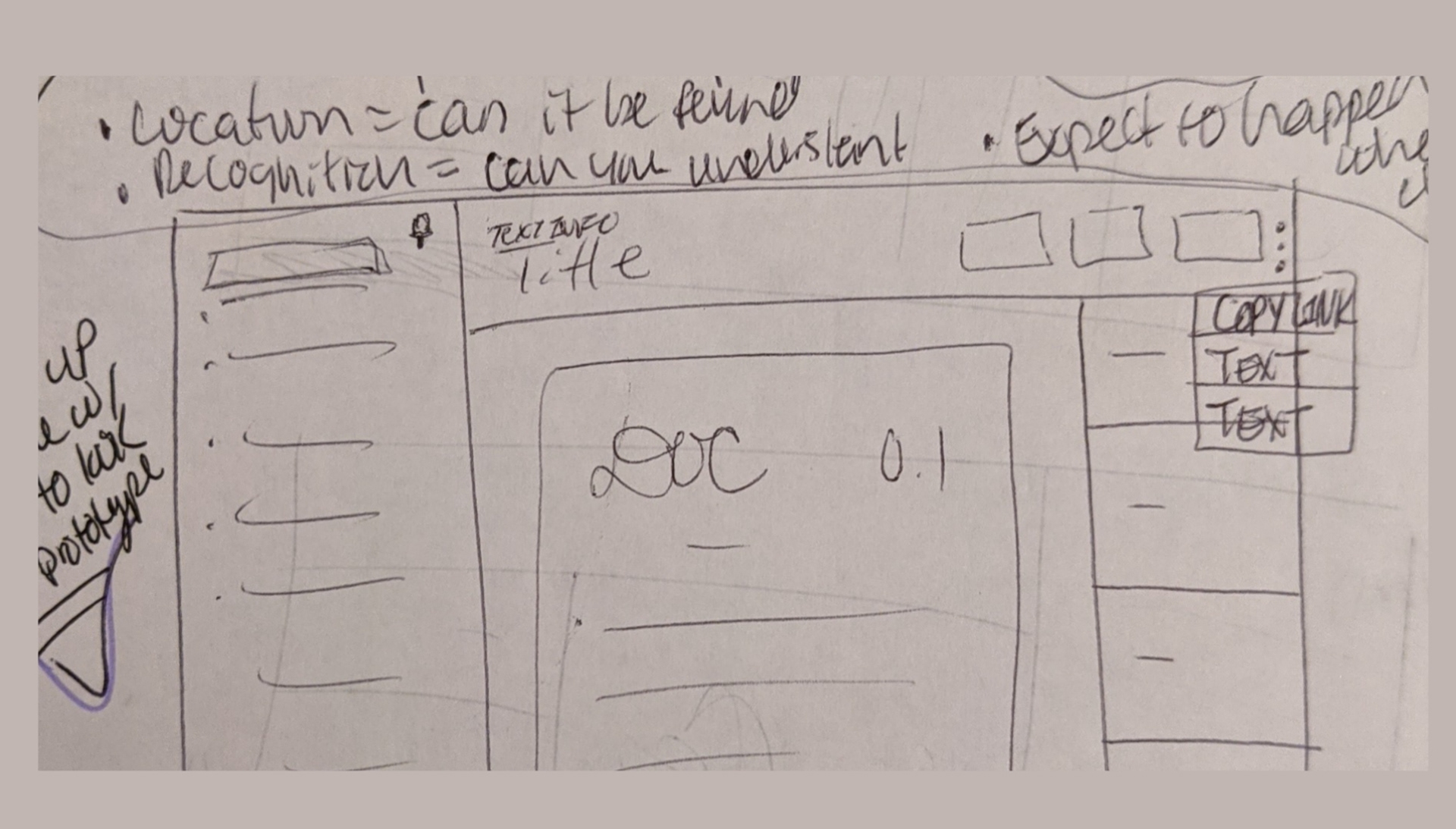
Brainstorming Sketches
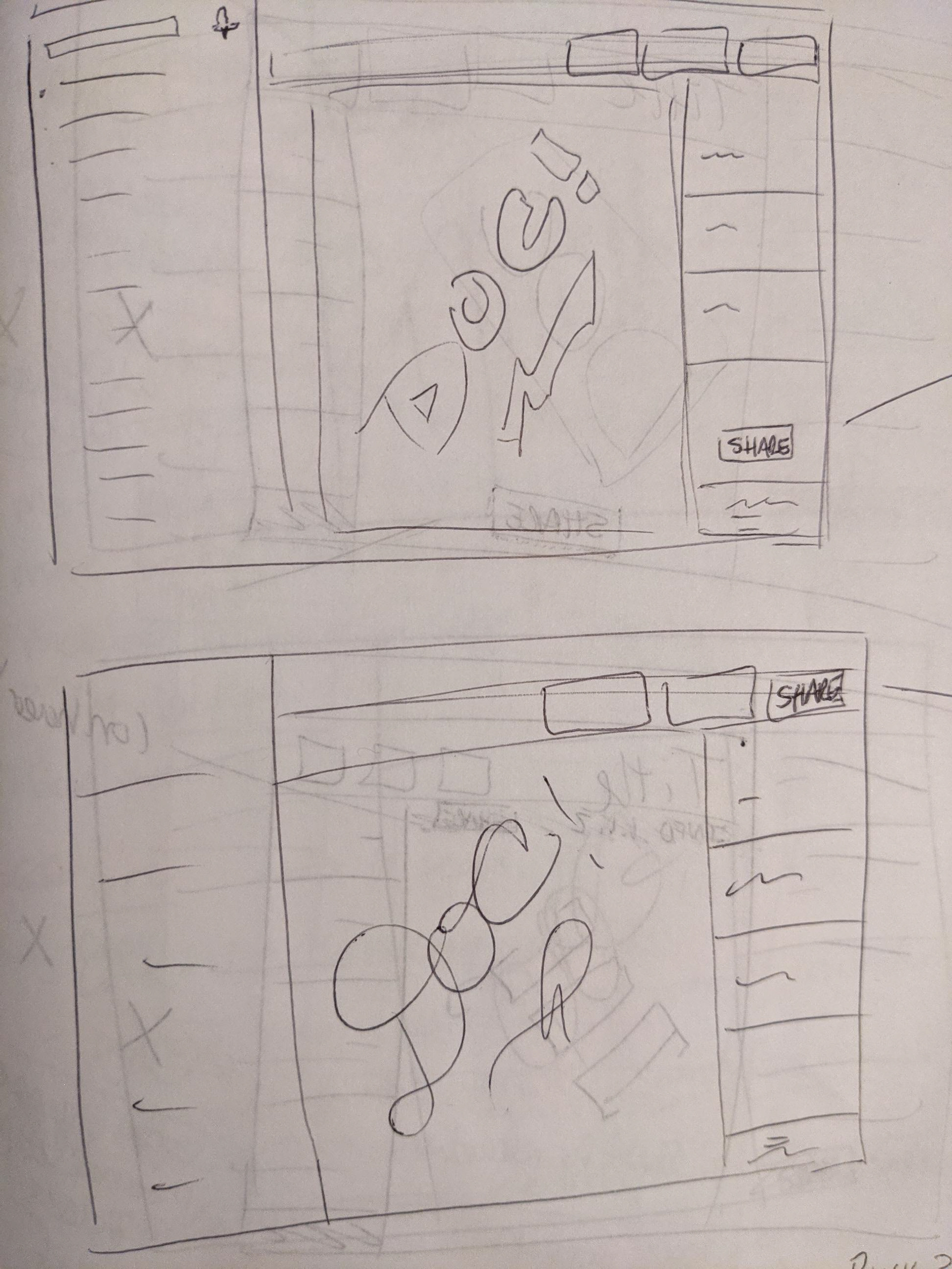
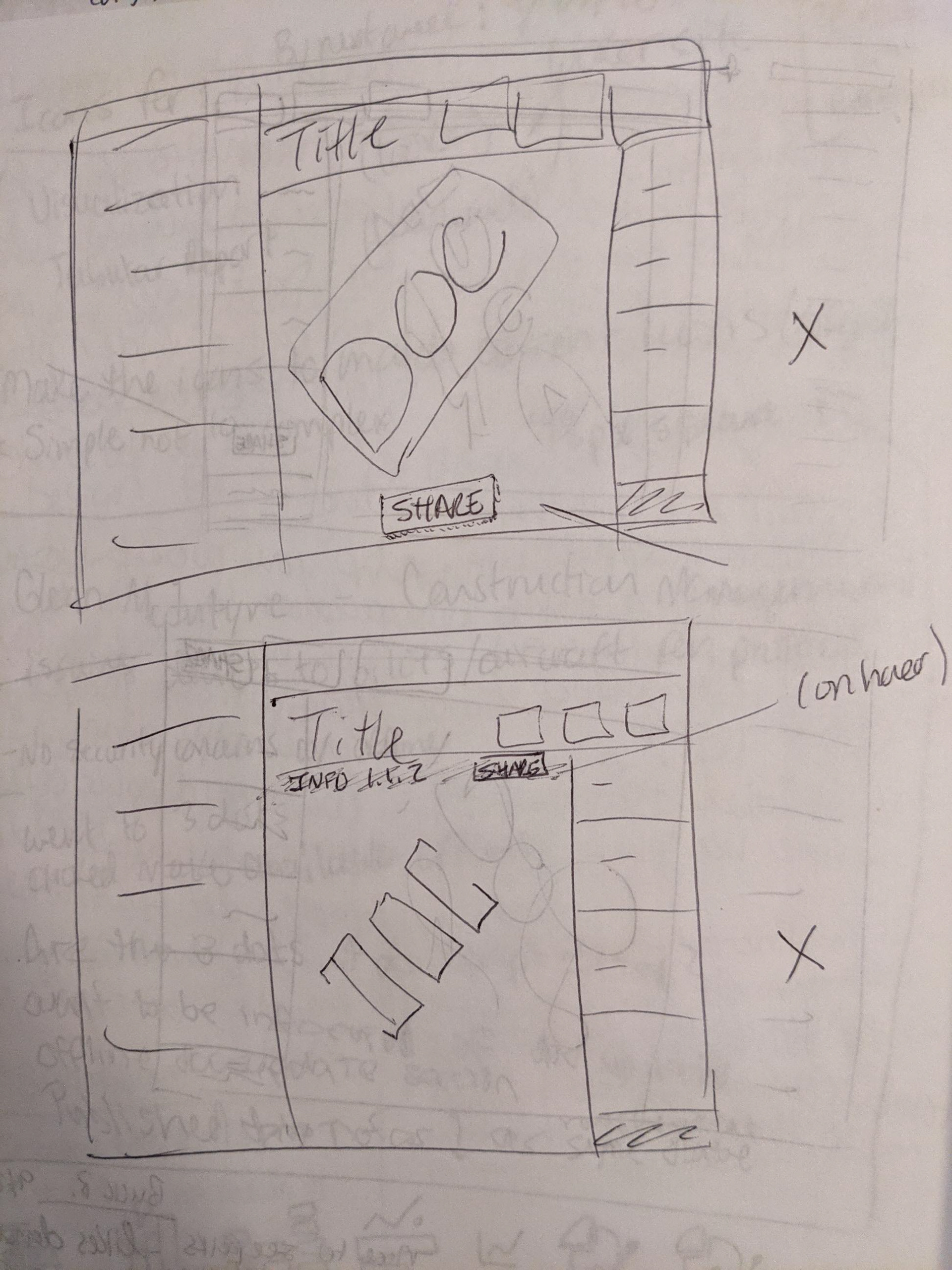
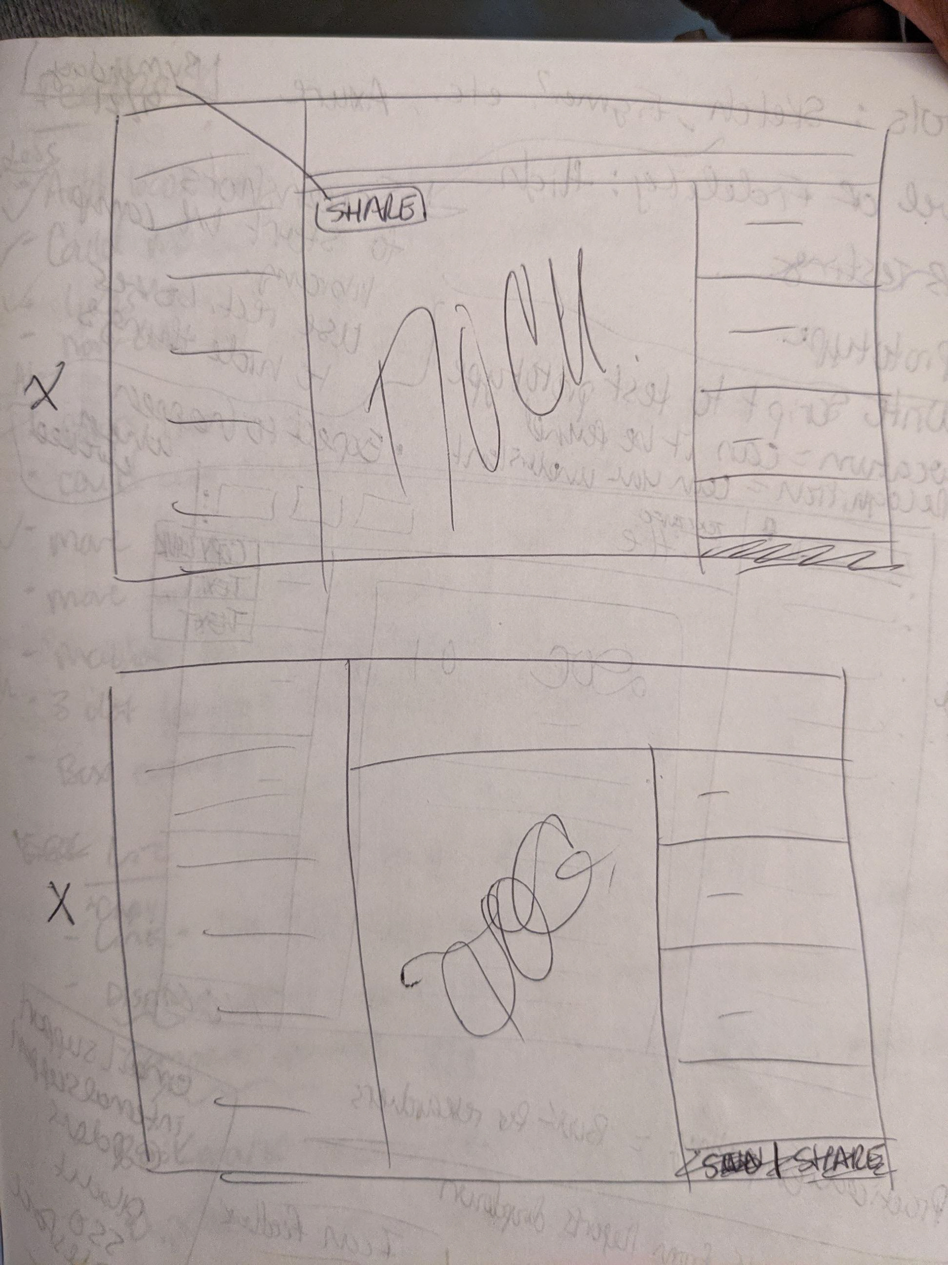
After enlisting the collaboration of my design team, we brainstormed by sketching quickly various ideas on how we could approach the copy functionality within the document view page. (only my crazy 8 sketches are shown). After having open discussion about the pros and cons of each approach; ultimately we all ended up with one sketch in common and discussed how to move forward with it.
Information Architecture
In creating this new menu design, it was necessary to audit all the existing menu options and improve on the existing actions and nesting structure.
Additional Constraints:
For ease of use we want to make necessary changes without creating an entirely new system to learn for our existing users. I needed to keep in consideration the business logic and how and which document actions affect the menu choices.
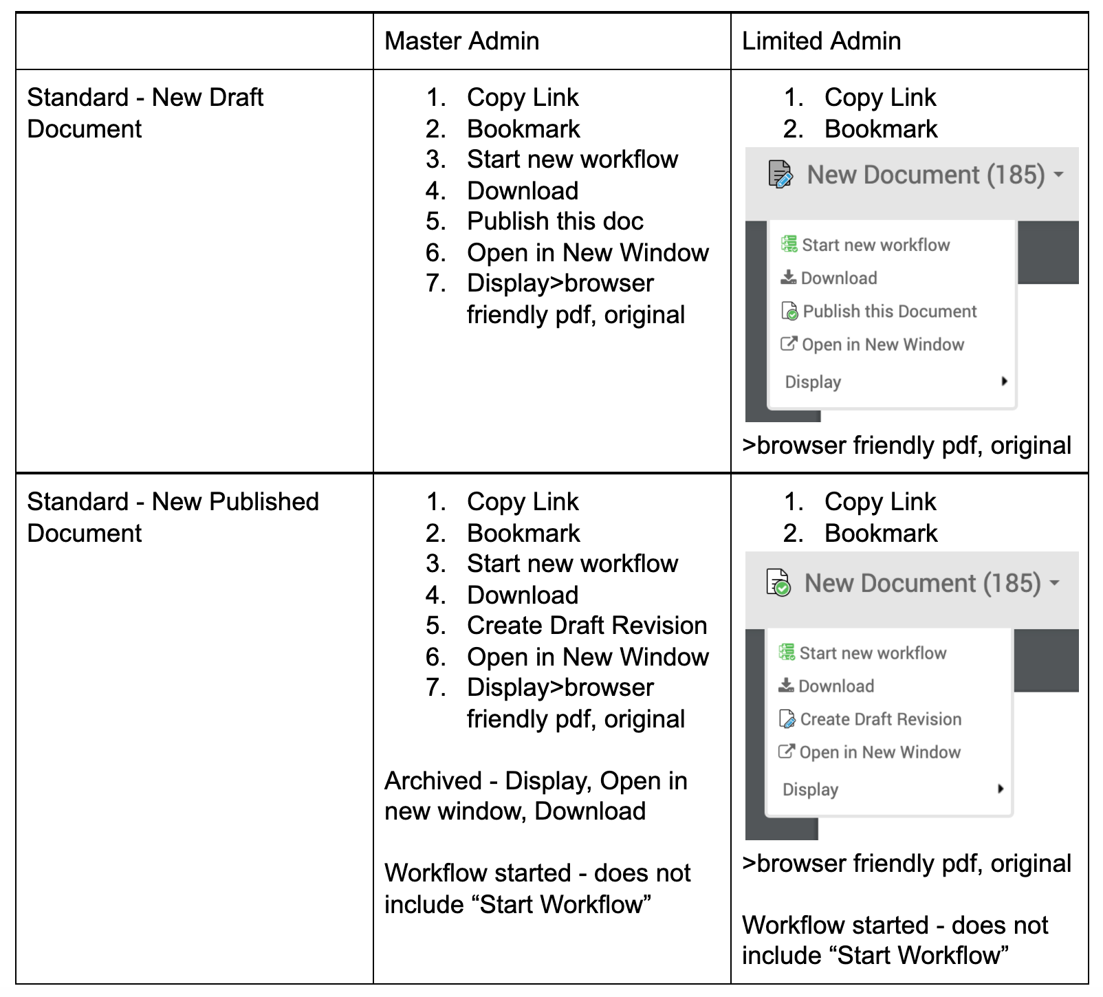
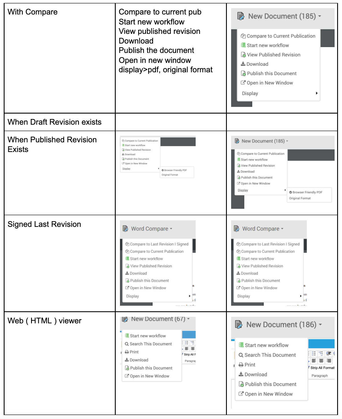
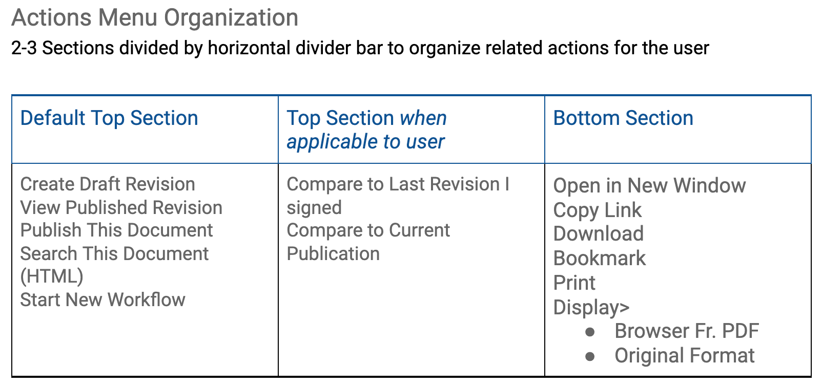
Organizational strategy to improve the menu structure, grouping related actions together within 1 of 3 sections,, shown when applicable to the document in view.
New Menu Design: 3-dot Actions Menu
Menu layout, location and functionality: Menu opens on-click of the 3-dot icon in the top right of the header section in the document view page of the product.
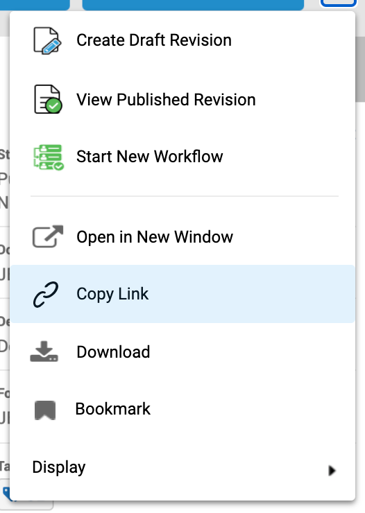
Open menu: Default Top Section and Bottom Section options displayed, Copy Link option shown in on-hover state
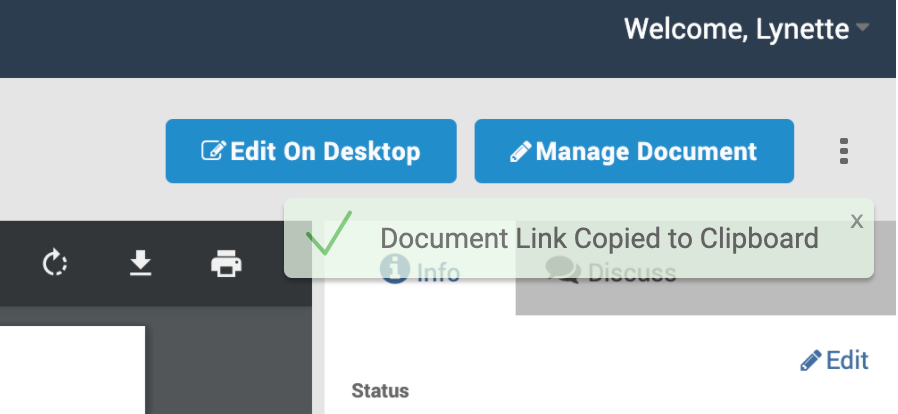
Toast notification appears and fades on-click of Copy Link menu option
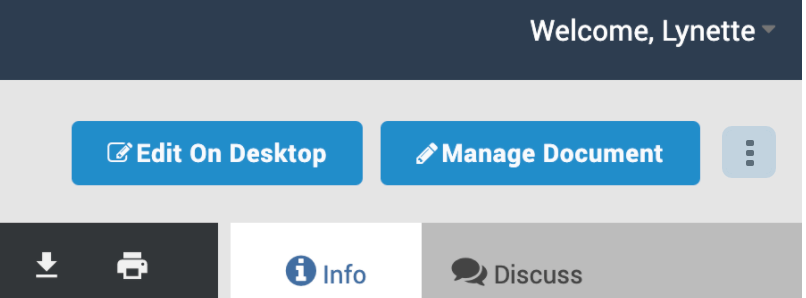
Hover state of 3-dot menu icon
Design Iteration
Additional Considerations
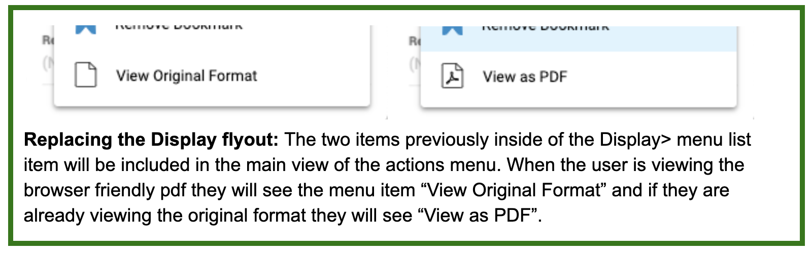
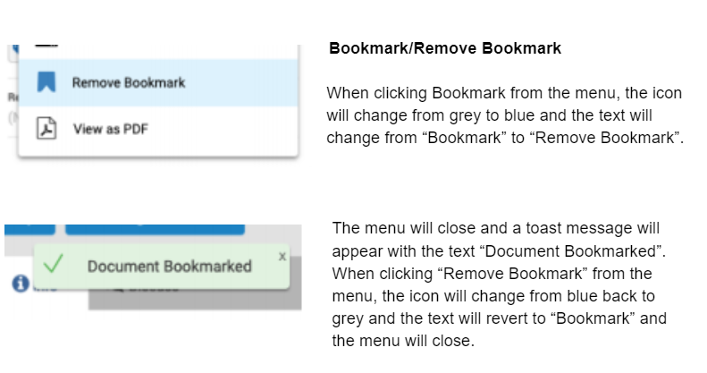
In addition to breaking out the options nested within Display (shown above) some other design considerations lived within the bookmark functionality. Bookmark is the only menu option here that toggles for the document in view. If the document has been bookmarked, the menu will include "Remove Bookmark" and the gray icon representing a bookmark will turn to blue. The opposite functionality exists for a document that is not currently bookmarked.
In both cases when a document changes to either state, a toast notification will show with the appropriate information (as shown to the right).
Onboarding & Usage
vdj
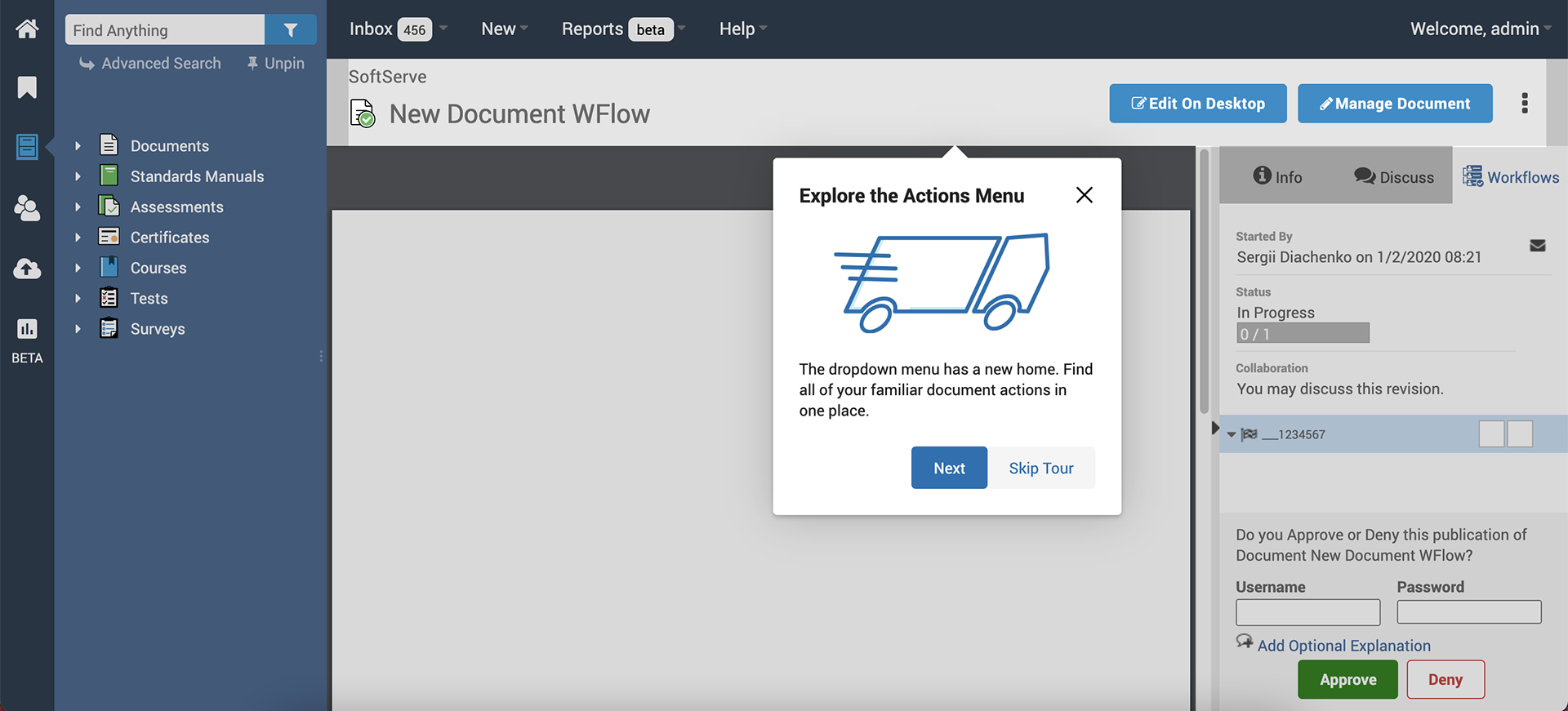
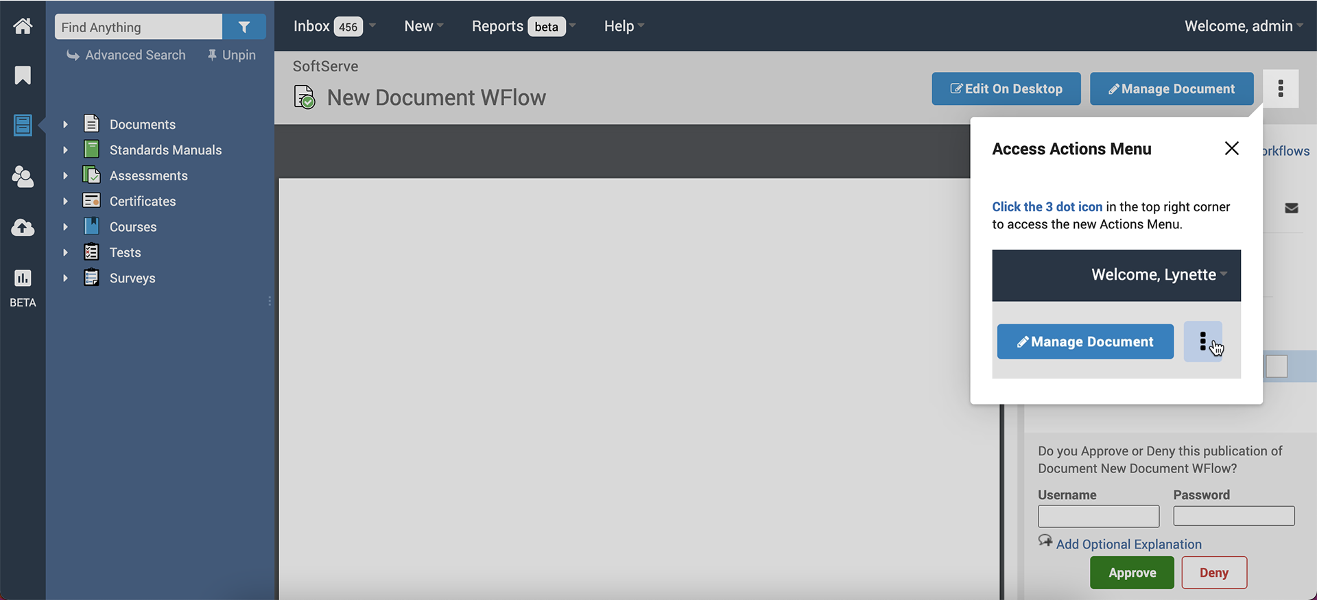
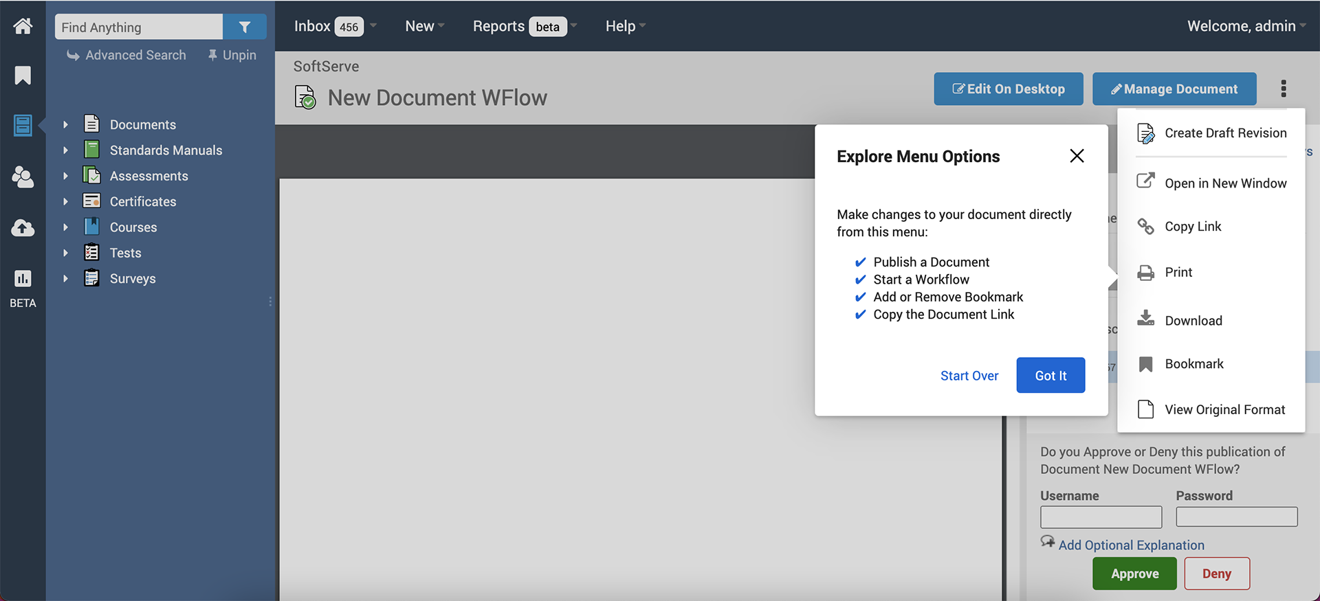
Onboarding Users to a New Menu
As these actions previously existed in a different section of this page, we wanted to let our users know where they could find their menu items. I created an in-app onboarding experience that highlights the new menu look and location and briefly explains what they can do here.
Success Metrics
Since the time of release we more than tripled usage of the menu and items within as compared to the old menu that was not very discoverable. Users were able to use this new menu quickly and continue on with their important tasks.

Looking Forward
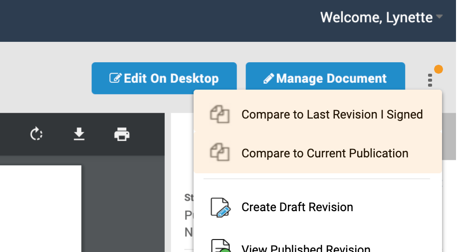
Adding onto this menu, something I considered was the inclusion of a notification setting for changes in the menu options; particularly the Compare options. This is a feature that is very favorable to our users and it would be beneficial if more users could easily find and use this when it is applicable to their document.
In the example (to the right) the orange "new" indicator would show additional options that are highlighted in orange at the top of the menu when they first apply. Once they open the menu and see the new options the indicator will disappear and hovering over the menu items will change them from the orange tint to their default hover state as the rest of the menu items are.